Gnuplot Tips
Today some ideas how Captcp generated throughput graphs can be modified and improved.
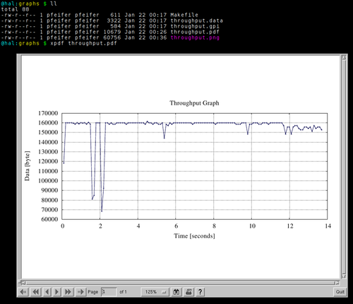
We start with a pcap file (captured via tcpdump or wireshark). We create a output directory, called graphs and finally start captcp and visualize one TCP flow. The number of the connection and flow (-f 45.2) is a result of captcp's statistic module - I just picked up one random flow within the capture file. The output of captcp is saved in the directory graphs. Note because we add the -i option captcp generate a Makefile and a gnuplot file, called throughput.gpi. So remember: remove the -i option to prevent an overwrite of these two files. The data file (throughput.data) is always overwritten at each captcp call - sure:
@hal $ ls
trace.pcap
@hal $ mkdir graphs
@hal $ captcp throughput -s 0.1 -i -f 45.2 -o graphs trace.pcap
@hal $ ls graphs
total 12
-rw-r--r-- 1 pfeifer pfeifer  611 Jan 22 00:17 Makefile
-rw-r--r-- 1 pfeifer pfeifer 3322 Jan 22 00:17 throughput.data
-rw-r--r-- 1 pfeifer pfeifer  766 Jan 22 01:06 throughput.gpi
If we call make in the directory the gnuplot is invoked and a PDF file (througput.pdf) is generated. So why generate captcp by default and without any argument a PDF file? Because the format is nice! It is a vector format (you can zoom into it), PDF files can be converted to raster graphics without any problems and PDF files can be included in LaTeX documents as a vector format as well. Finally the options to modify the image is much larger then any other format. We can change the Font, we can include Postscript Math Symbols and so on. Another possibility is svg (scalable vector graphics), which Gnuplot also supports. Advantage is that SVG formats are out of the box supported by every Webbrowser. Major disadvantage is the visual nature of Gnuplot generated SVG's - I think the graphs looks really deformedly, compared to PDF. But there is no hindrance not to edit throughput.gpi and change to SVG output or any other supported format. PDF is just the default format - not more.
To generate a PNG file (suitable as a webgraphic or for M$ Word) you can execute make png. This will generate a PNG file from the PDF via epstopdf(1). So this program must be installed to generate PNG files. So why generate PNG files based on the PDF files - why not directly you may ask? Because Gnuplots PNG terminal is limited in the functionality. If we always generate PDF files we had a single source (PDF) and just make modification there. Here is a screenshot, showing the directory structure and the current TCP throughput graph.
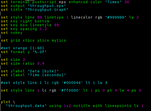
Open througput.gpi to start editing the style, format and look of the graph. First we just draw the graph in red and with a thicker line. Maybe the new image will looks now better one web-pages. The standard version is eventually more suitable for papers and publications.
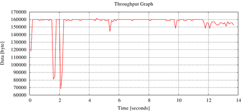
The next image show the results:
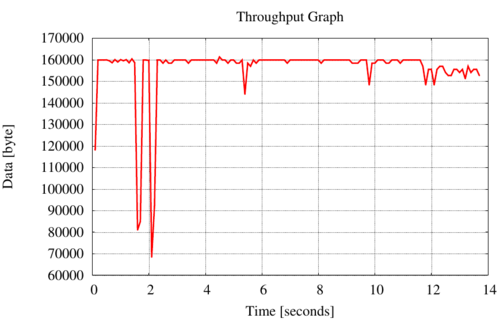
Increase the font-size, change the paper ratio and draw the line even thicker makes the suitable for presentations:
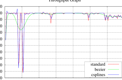
Another nice Gnuplot capability is data interpolation and approximation of data - called smoothing by Gnuplot. Gnuplot provides several algorithms: unique, csplines, acsplines, bezier, sbezier. The next image show three algorithms in one illustation.
I found another nice formating on gnuplotting.org - a really nice Gnuplot site!

set style line 11 lc rgb '#ffffff' lt 1
set border 0 back ls 11
set tics out nomirror scale 0,0.001
set format ''
set mxtics
set mytics
set style line 12 lc rgb '#ddccdd' lt 1 lw 1.5
set style line 13 lc rgb '#ddccdd' lt 1 lw 0.5
set grid xtics mxtics ytics mytics back ls 12, ls 13
Fin