Description
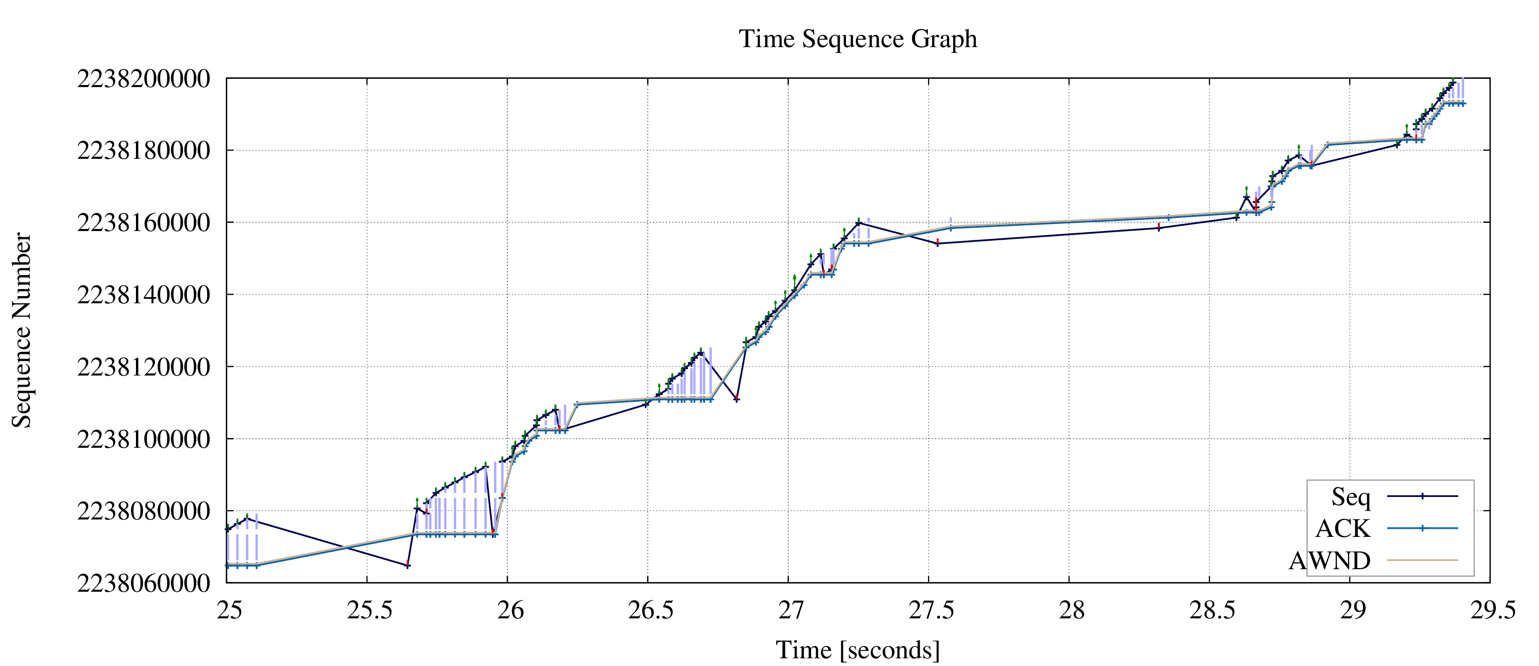
The TCP Time Sequence Graph is one of the more professional modules. It visualize the packet TCP sequence number over time with additional information about the advertised TCP Window, retransmissions, ACK and SACK information.
This visualization is quit powerful: the rise is a indicator over the available bandwidth (the higher the gain the higher the throughput). Differences between Sequence Number and advertised window can show if the receiving application sleep too long or if the receiving stack has problems with the right buffer sizing. Retransmission (colored as red arrows) point to channel problems or packet drop and so on. One time I will write a tutorial how to interpret this extended version of Stevens Time Sequence graph.
The following image show TCP characteristic over a link with ~20% packet loss rate.
Options
| Short option | Long option | Description |
|---|---|---|
| -f connections | --data-flow=connections | specify the number of relevant id's |
| -t timeframe | -time=timeframe | select range of displayed packet |
| -Z | --zero | start sequencenumber with 0 in graph |
| -e | --exended | visualize extended information (PSH, ECE, CRW) |
| -i | --init | create gnuplot template and makefile in output-dir |
| -o outputdir | --output-dir=outputdir | specify the output directory |
| -h | --help | print this help screen and usage info |
Zero Option
Per default the Time Sequence Graph will use real sequence
numbers on the Y-axis. TCP's ISN (initial sequence number) is
"randomly" chosen by the TCP stack.
("Randomly" means under Linux a function of source
port and destination port, source and destination address and
hashed with a secret. Because the ISN must monotone increase
the value is mapped in the upper bits in the ISN where the lower
bits are the system time. See section 3 of
RFC 6528 for
discussions of the ISN.) Which leads often in hard readable
numbers on the axis. The Zero Option (-Z or
--zero) will set the initial sequence number to 0
and shift all successive sequence and ACK numbers by this
delta. This includes TCP SACK (Selective ACK) numbers as well
as the advertised window.
Nice effect of this option: it is instantly visible how much data was transmitted over time. The following image show a graph, generated w/o zero option on the left hand side and on the right hand side a graph with zeroize enabled. As you can see, approx 1.4MB are transfered.
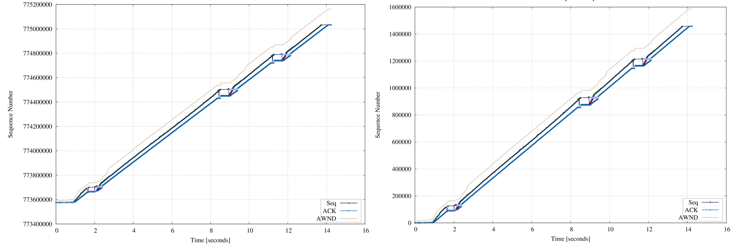
This option stop your boss asking what the large numbers on the y-axis mean! ☺
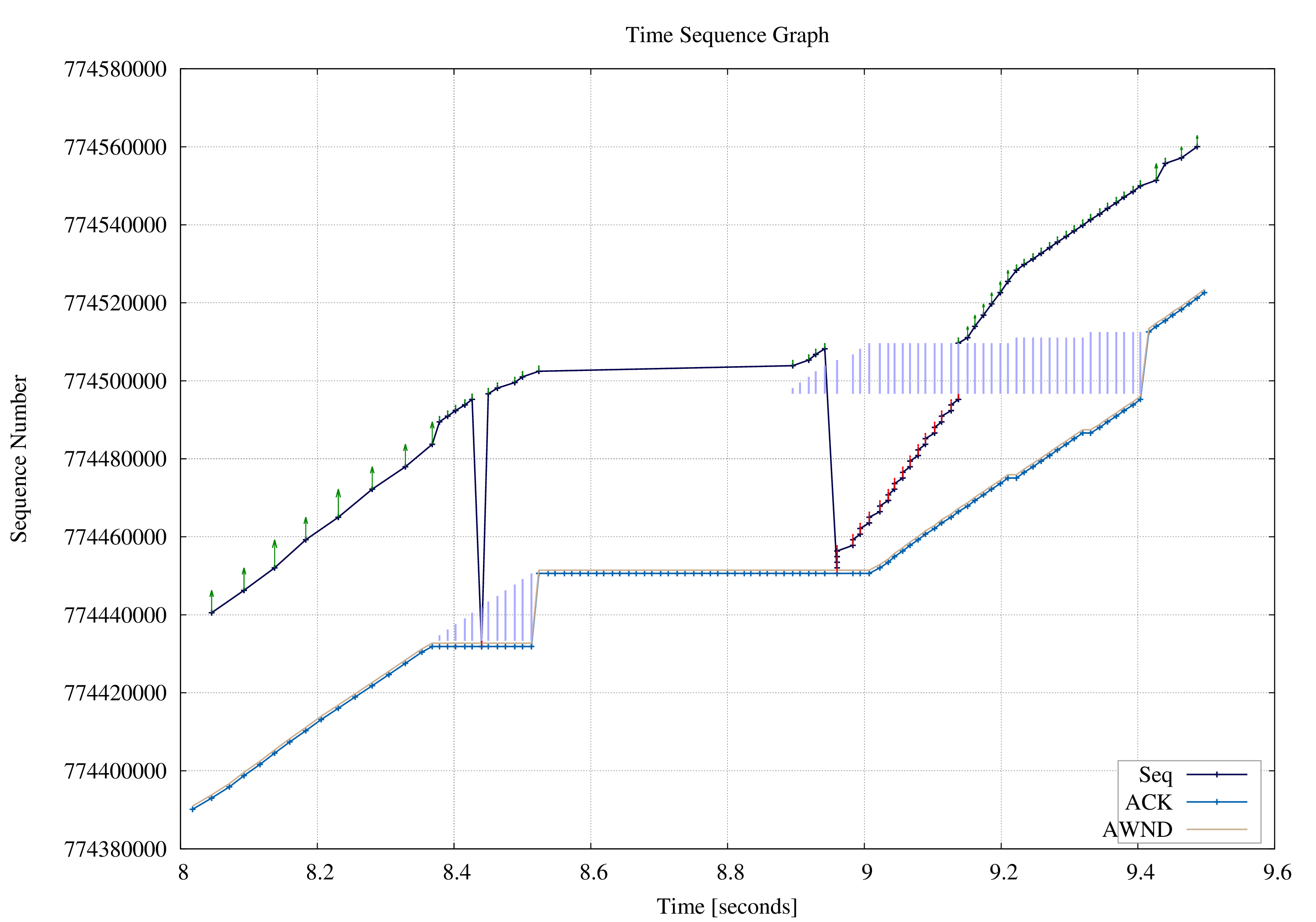
Timeframe Option
The Timeframe option provides a way to zoom into the relevant parts of the trace. To limit the graph from 8.1 seconds to 9.5 seconds the following captcp command can be used:
captcp timesequence -i -o timesequence-dir -t 8.1:9.5 -f 1.1 upload-2MB.pcap
cd timesequence
make png
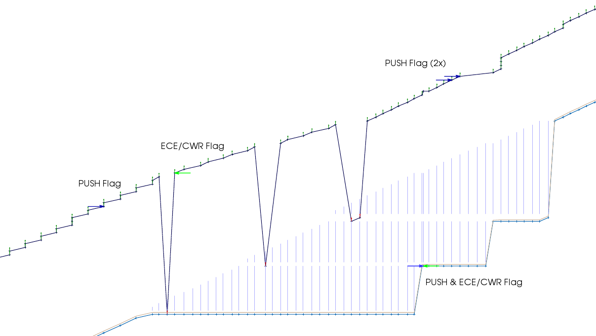
Extended Option
The extended option (since Captcp v1.1-12-g45ad170) show additional TCP packet information:
- Push Flag
- ECE (ECN, RFC 3168) Flag - ECN-Echo
- CWR (ECN, RFC 3168) Flag - Congestion Window Reduced
The Push flag is visualized with a arrow in the data direction - just as a push toward the data: ⇒. ECE and CWR are visualized in the opposite directory: ⇐, like a marker "stopping" the data flow. The option is by default disabled because the plot can be rather overloaded and is rarely beneficial. Note that CWR marker is visualized a little bit darker: , where ECE marker is colored in plain green: